


Clock Four—a San Francisco ad agency, had a reputation for being masters of complexity. I was asked to bring fresh energy to their development heavy emphasis, to find a new visual language to shore up their strengths.
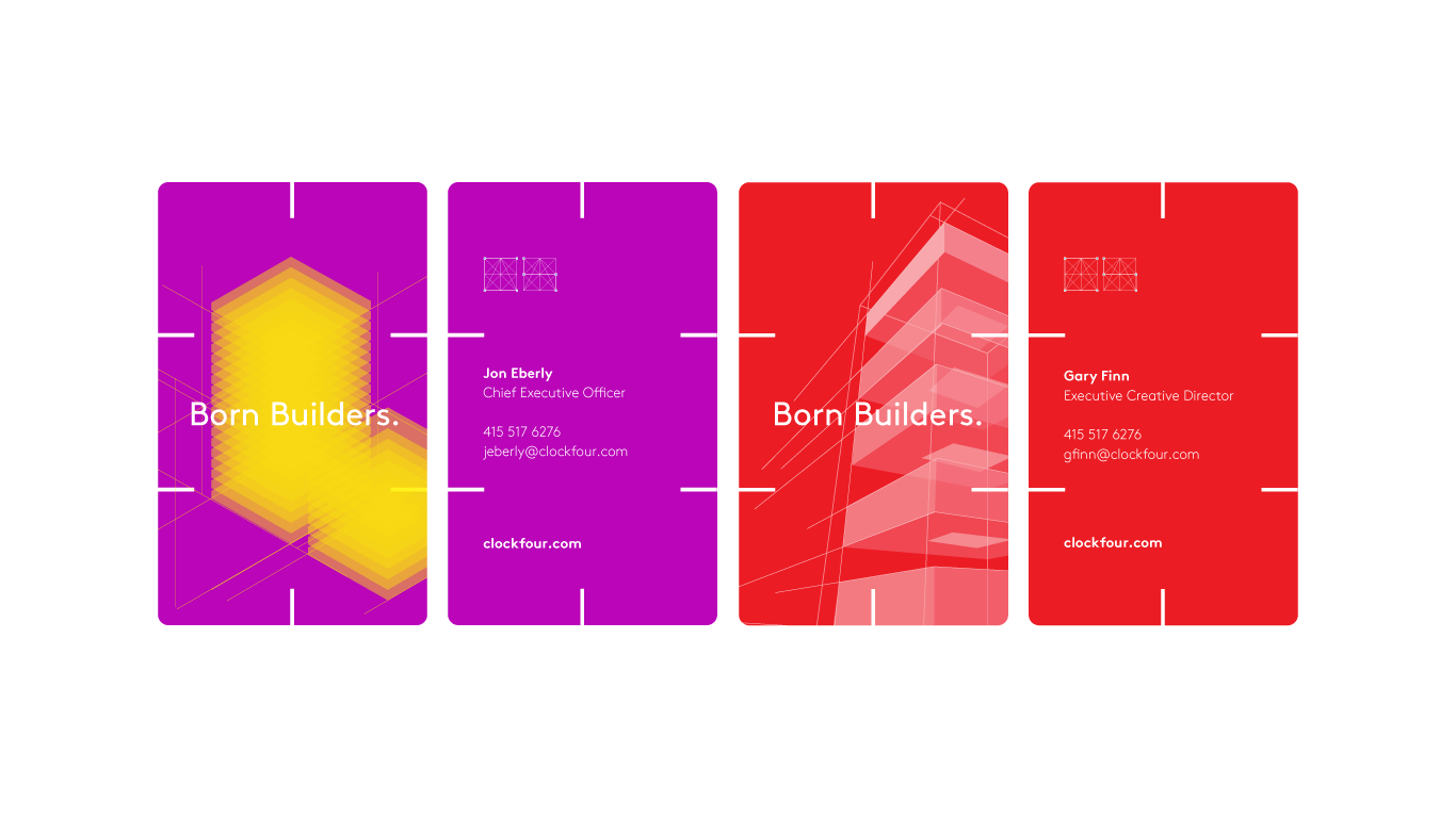
Working alongside copywriting guru Brendan Gately, I expanded on a visual theme of building, focusing on a blueprint-inspired identity and an arresting color palette.
For the C4 website, I wanted to convey the concept in as few strokes as possible, keeping the site minimal, fresh and free of visual clutter.
I extended this same approach to a poster format, maintaining a light, minimal brand footprint.
Building on the same theme, I added a secondary design—utilizing a scarlet red to compliment the purple.
I envisioned a business card constructed from colored acrylic, with slats at intervals—allowing someone to build a structure from the cards, a personal expression of the Born Builders concept.